Hello everybody, before we start i just wanted to say that the Nothing Phone 2a Plus caught my eye when i first heard of its existence mostly because of the branding behind it and the fact that it tries to do something different compared to other phone brands. Lets get started.
1. Unboxing
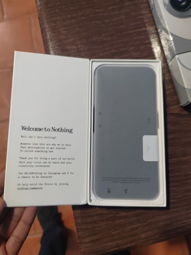
To start off, here what’s inside the box:
Nothing Phone 2a Plus
USB C to C cable (The cable supports up to 60w fast charging PD 3.0 and PPS)
Sim Ejector Tool that’s transparent
User Manual


2. Design and Display
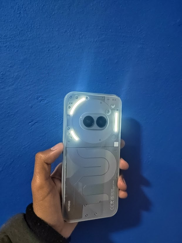
The main attraction of this particular phone is of course its back design. The two camara sensors are placed in a way that it looks like eyes and on the bottom you can see the gray looking NFC coils that give it a signature look and the tiny screws. This phone will catch a lot of eyes because of its unique appearance which I for one like a lot.


The phones rear is plastic which does tend to get a lot of fingerprint smudges but it is very comfortable in your hands. The volume buttons are to the left side of the phone and the power button is on the right side. The sides of the phone are a polycarbonate plastic which feels premium considering its a midrange device and is plenty sturdy. It also has the one and only Glyph interface which are three led strips that ill talk a bit more later.
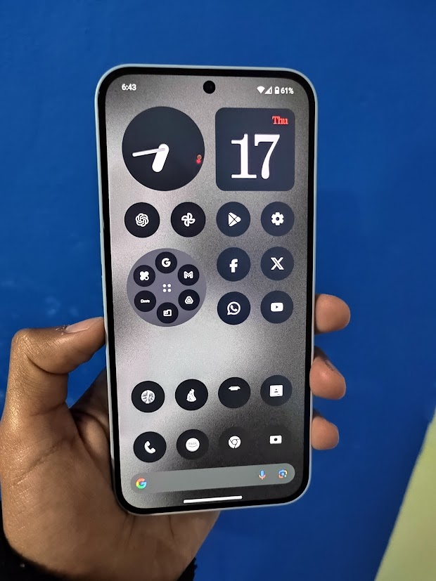
It has a 6.7 Inch 120hz Full Hd+ AMOLED flat display with an in-display optical fingerprint sensor protected with gorilla glass 5 screen with a pre-applied plastic screen protector with symmetrical bezels which gives it a premium look. Compared to other devices the symmetrical bezels are unique to this midrange device which other manufactures tend to always either use curve screens to give the illusion of having small bezels or always have the bottom bezels bigger then the rest of the display. The phone gets plenty bright especially on sunny days up to 1100 nits and 1300 nits of peak brightness when watching HDR content with a resolution of 1084 × 2412 (~395 ppi density).
It has a speaker grill on the bottom and has an amplified ear peace at the top which gives you a stereo speaker experience. There plenty load enough and have good bass.

3.Specs
Dimensions:161.7 × 76.3 × 8.5mm
Weight:190g
Display:6.7-inch 1084 × 2412 30-120Hz AMOLED
Chipset: MediaTek Dimensity 7350 Pro
RAM:8GB / 12GB
Storage:256GB
OS (at launch):Android 14
Primary camera:50MP, f/1.88, 84.5° FoV, 1/1.57-inch sensor w/ OISUltra-wide camera:
50MP, f/2.2, 114º FoV, ½.76-inch sensor
Front Camera:50MP, f/2.2, 81.2º FoV, ½.76-inch sensor
Battery:5,000mAh
Charging:50W wired PD 3.0, PPS protocol
IP 54
Dual sim
Bluetooth 5.4 ( LDAC, LHDAC , aptxhd, AAC, SSC)
Colors: Black, Grey
The phone is powered buy an exclusive MediaTek Dimensity 7350 pro Chipset a slightly better chip then the regular Nothing Phone 2a. A 10% increase to CPU and 30% on GPU. For everyday use it does a good job, gaming wise it does fairly well even on slightly demanding games and has excellent thermal management. The phone itself gets slightly warm when using it intensively but never gets too hot, which is impressive for a midrange device.
4.Cameras
Photography wise it doesn’t excel that much compared to other devices in its price range but does take decent images.


What’s weird to me is that online a lot of people say the the cameras are very good for the price range that its in but looking into it now there really not to impressive. I feel like these camera sensor are capable of getting really great photos, but there sort of not properly used too its full potential. Hopefully they get better in an update along the line.
5.Nothing OS
The software skin that this phone is currently on is called Nothing OS 2.6 on top of Android 14. It´ll get three years of software updates and four years of security patches. Nothing OS feels very clean and has a signature look and feel. It utilizes a monochromatic UI look so that u don’t get distracted by regular color apps that would normally get your attention. It manages to make you decide if you really do need to open the app or not. You also get custom widgets (24 in total) that utilize this look for clocks, calender, music player so you can retain that consistent Nothing look.


Glyph Lights
The main sort of “gimmick” if you’d like to call it that is the Glyph interface. There are 3 led light strips on the back of the phone that can be used to primarily customized for notifications and alerts. The Glyph Menu contains Brightness, Ringtones, Notifications, Flip to Glyph, Glyph Timer, Composer shortcut for custom Glyph ringtones, and Visual Feedback for Volume control, Charging meter, Google Assistance, Music Visualizer and third-party apps (Uber, Zomato and Google Calendar for now).


Now the main question, are they useful? Well, it depends on what your mainly gonna use it for. If u have certain messages that’ll you’ll receive that are important to you, you can set a specific glyph light preset pattern for that contact or app. For calls, you can assign a ringtone to each of your contacts. This way, not only do you get audible confirmation of who’s calling, but if the phone is placed face down, then the unique light pattern on the back can also inform you of the caller id. Of course, there are only ten custom ringtones, so there’s only so many unique callers you can assign them to, but there is a Glyph composer app that you can get on the Play store that´s made by NOTHING and tune your own patterns.

The one feature that i use a lot is Flip to Glyph. When enabled you can flip your phone face down and it´ll give you silent lights only notifications and calls. Its pretty cool feature.

Battery
It does a very good job battery wise. During my use i got around 6-7 hours of screentime on a full charge with 30% battery left when web browsing, a couple of YouTube videos, social media, music and some light gaming. It supports 50W fast charging but sadly doesn’t come with a charger brick. To be able to use fast charging you need a charger that supports Power Deliver 3.0 (PD 3.0) and PPS. It should top around 50 % in 30 min, and around an hour from 0 to 100%. Nothing claims that even after 1,000 charge cycles it’ll still retain 90% of its original battery capacity which is much appreciated compared to other brands.
6. My Final thoughts
To end this off, my experience with the Nothing Phone 2a plus was very enjoyable. I very much liked the monochrome UI look, tho its not for everyone( Good thing you can disable it if you want to). The cameras could use an improvement hopefully in an update. The Glyph interface is something that also depends on what your going to use it for. The battery is honestly one of the best in its category.
Should you buy it? Well it depends on where your from. Here in Mexico its around MX$9,499.00 in the official Nothing website and in Mercado Libre around MX $8,799. For what it offers it really isn’t worth it. There are better phones for way cheaper and have better specs like for example the POCO X6 pro, its got a better chipset, better screen, camaras are similar and its priced at around MX$6,199.00 on the official Xiaomi website for the 12 GB ram and 512 GB space version.
If you want more complete phone for a similar price there’s the Galaxy A55 price on Amazon for MX$6,880.00 for the 8GB 256GB version. You get IP67, up to 4 generations of OS upgrades, up to 5 years of security updates, way better cameras, SD card slot and Gorilla Glass Victus.
I feel like the Nothing Phone 2a Plus only exists for people that liked the regular Nothing 2a and wanted a slightly better one. If you really want this phone i think its best you get the regular Nothing Phone 2a, your not going to miss out on much. The only thing that changed between the 2 is slightly faster charging (from 45W to 50W), a better selfie camara (from 32MP to 50MP) and a slightly better chipset.